I’ve struggled to find references to this online, but heard the name used multiple times this year when describing the approach outlined here. To the best of my knowledge, the "Component Islands" pattern was coined by Etsy's frontend architect Katie Sylor-Miller during a meeting we had in 2019.
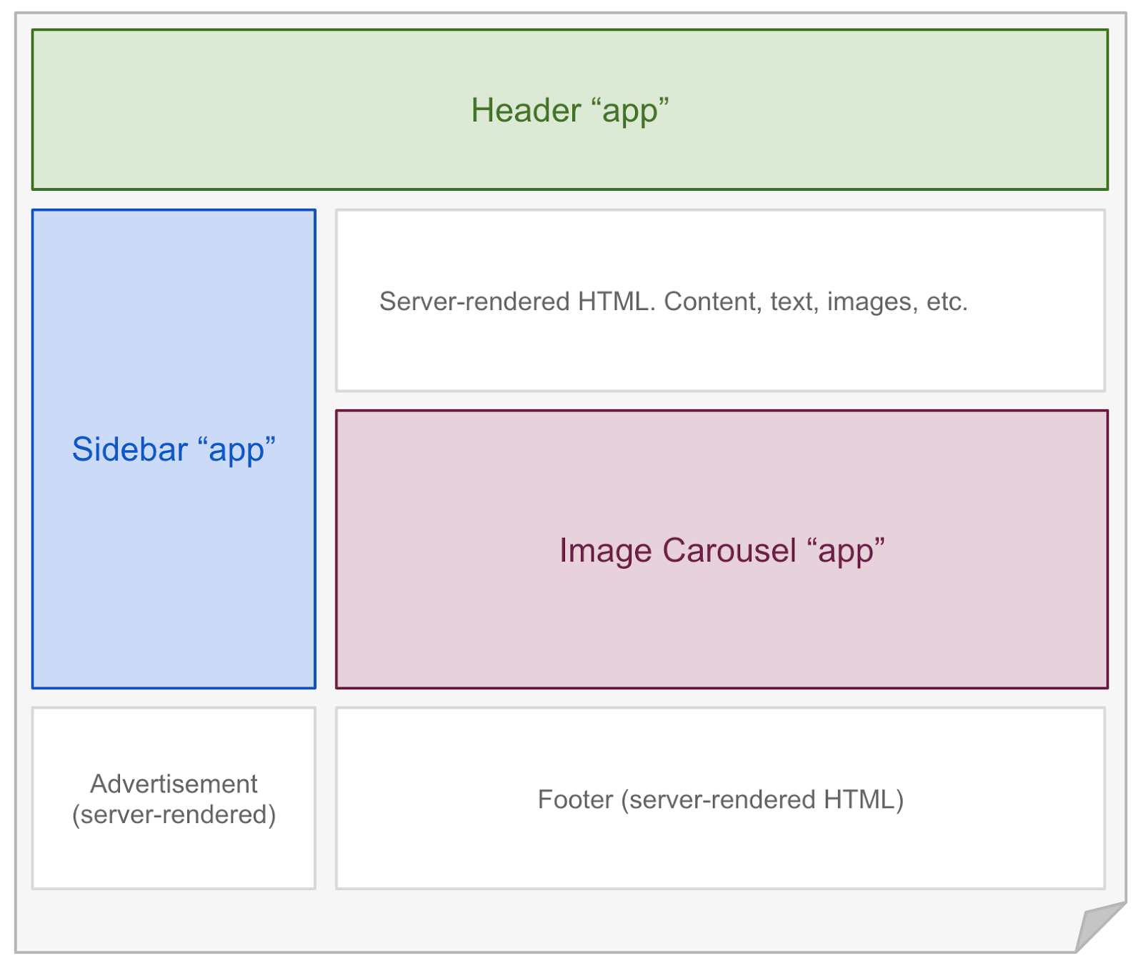
The general idea of an “Islands” architecture is deceptively simple: render HTML pages on the server, and inject placeholders or slots around highly dynamic regions. These placeholders/slots contain the server-rendered HTML output from their corresponding widget. They denote regions that can then be "hydrated" on the client into small self-contained widgets, reusing their server-rendered initial HTML.
You can think of this like a static HTML document that contains multiple separate embedded applications:

This may seem similar to "micro-frontends" at first glance. Both approaches share the idea of breaking applications up into independent units, however "micro-frontends" do not typically imply that composition of those units is achieved using HTML.
A closer analog to the "islands" approach would be progressive enhancement, to which we're essentially adding SSR hydration and a consistent metaphor for adding interactivity to a region of the page. In traditional progressive enhancement, we might have a <script> that looks for an image carousel in the page and instantiates a jQuery plugin on it. Instead, that image carousel would be rendered on the server and a dedicated <script> emitted for it that loads the image carousel implementation and in-place upgrades it to be interactive.
Why does this matter?
As it turns out, there are a number of benefits to the group of approaches described here when compared to typical Single Page Application architectures.
"Progressive Hydration" for free
I’ve touted the performance benefits of Progressive Hydration techniques for frameworks like React, Angular, Preact and Vue. With these architectures, individual widgets on a page are loaded and initialized over time. This can be done using a simple scheduling approach via requestIdleCallback, or can take additional factors into account like viewport visibility, interaction likelihood, product value, etc.
Similar to Progressive Hydration, rendering pages using an islands architecture results in the heavier dynamic portions of the page being initialized not just progressively, but separately. This means individual regions of the page become interactive without anything else on the page needing to be loaded first.
Unlike Progressive Hydration, the approaches that fall out of building around an islands architecture do not require top-down rendering. This is a distinct advantage, since there are no outer “root” components that must be initialized before their descendants. Each part of the page is an isolated unit, and a performance issue in one unit doesn't affect the others.
SEO and UX aren’t a tradeoff
The status quo for SSR as used by Single Page Applications is that it’s often cited as a necessity for SEO reasons. However, SSR can actually have a net negative impact on User Experience - visitors are left waiting for the actual functionality of a page to arrive while staring at a frustratingly fake version of that page.
Many applications also suffer from silent SSR performance pitfalls without realizing it. In virtual DOM libraries, it's easy (and common) to accidentally construct a situation where first render destroys the server-rendered HTML DOM, only to recreate it again from scratch (often synchronously). This is the result of some common misconceptions, which may stem from documentation giving an idealized view of hydration while passing over tricky caveats and footguns.
Even in cases where SSR hydration is functioning as designed, the status quo leaves a lot to be desired. The amount of JavaScript work being performed during page load is still many orders of magnitude more than what might be considered "efficient".

In an "islands" model, server rendering is not a bolt-on optimization aimed at improving SEO or UX. Instead, it is a fundamental part of how pages are delivered to the browser. The HTML returned in response to navigation contains a meaningful and immediately renderable representation of the content the user requested.
Sections of that HTML may be missing their client-side interactivity, but the document should at least contain the most essential content. For example: a news page’s HTML would contain the article body, and a product page would contain that product’s description.
All of the other content is secondary to this information, and its inclusion in the HTML becomes a product decision. How vital is this bit of information to a user visiting the page? How important is that widget to the business model? A "buy now" button that directly relates to revenue should be easily prioritized over a site feedback survey button that relates to information gathering.
Better for accessibility and discoverability
A website that uses standard HTML links for navigation is easier for assistive technologies and web crawlers to use. This is true regardless of whether links or forms are intercepted by JavaScript and rerouted to client-side logic, because the underlying assumptions remain true: clicking a link navigates to the given page.
Anecdotally, think of the number of times you’ve been sent a “link” to what the sender assumed was the page they were viewing, only to realize the link contained none of the necessary information:

Building page-based applications doesn't completely prevent these types of strange experiences, it only makes the decision to do so more direct. It makes the default outcome the accessible one.
When it comes down to it, shipping an architecture that requires less code to do something is the type of long-term benefit your future self (or coworkers) will thank you for. It's possible — likely, even — that adopting a model like this requires more up-front design thinking. There are far few batteries-included options available for decomposing apps into independently deliverable widgets. Who knows, maybe we can fix that.
